An attempt at building a mobile app for non-technical users creating an LLM-based chatbot
This project explores a mobile-first experience for first-time users building their own AI assistant using a large language model (LLM). I also set a time limit of 8 hours to complete this project.
I designed the full journey with a focus on clarity, pacing, and accessibility. The goal was to help non-technical users train and manage their assistant through a guided, conversational flow that feels simple but powerful.
If you’d like to explore the hi-fi prototype right away, click here!
A quick persona for a POV

To stay grounded in a real-world use case, I created a quick persona to guide design decisions. Clara represents a non-technical small business owner who needs a quick and foolproof way to set up a chatbot for her business.
Her priorities thus shape the flow, tone, and interface choices throughout the project. I did a bilingual version of the persona (English and French) to reflect Montréal’s linguistic landscape, where Clara is based.
Stage 1: access and authentication
Objective
Help new and returning users access the platform smoothly, using clear vertical hierarchy and familiar login patterns.
Approach
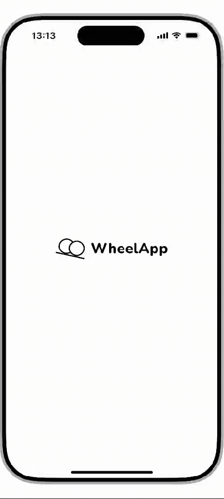
- This flow includes a splash screen, login form, and signup form.
- The splash screen establishes brand presence but stays unintrusive.
- Vertical hierarchy guides the eye, with the signup path visually present but deemphasised.
- Familiar social icons provide quick, trusted access via SSO.
Stage 2: onboarding flow
Objective
Guide first-time users through naming, contextualising, and training their bot in a way that feels conversational, manageable, and non-technical.
Approach
- Each screen in this stage continues handling a single task, using progressive text disclosure and a consistent layout.
- A conversational tone and soft transitions are used to make the experience less daunting for users.
- A visible stepper (step 1 of 3) helps a new user stay oriented and feel less certain about the task.
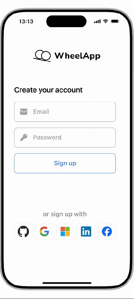


- This conversational style is repeated throughout this stage, including:
- Naming your business
- Uploading a knowledge base source
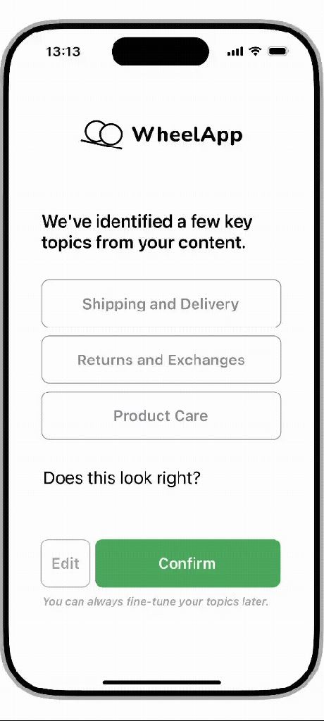
- Checking your knowledge base topics
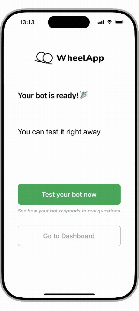
- Finishing up bot creation
- The slideshow to the left shows each remaining step in the onboarding flow.
Stage 3: testing the bot
Objective
Let users immediately test their bot in a clean, familiar interface, encouraging curiosity and confidence without overwhelming them.
Approach
- Interface modelled after familiar chat apps to reduce friction and create instant usability.
- Prompt chips offer guidance to solve the cold start problem.
- A typing indicator mimics human pacing and keeps users engaged.
- Plain language buttons are added after a response for users to provide instant feedback.
- The goal here is to reinforce trust and responsiveness in a low-pressure setting.
Stage 4: dashboard
Objective
Provide users with a clear and scrollable one-stop overview of their bot’s content, settings, and performance.
Approach
- Further navigation to other bots and user settings are kept in the top menu bar to stay out of the way.
- A card-based layout organises the bot’s settings into distinct, tappable sections.
- Icons are used extensively to support scanning and reduce reading fatigue.
- A light fading effect is used at the bottom to indicate scrollability.


- Non-technical language like “backup” is used rather than technical jargon like “fallback” used in LLMs.
- In the bot-specific screens, the bot dropdown menu is removed to remove clutter.
- Blue pencil icons explicitly signal that the message can be edited.
- A clear divider line subtly signals a shift in complexity and intended audience for developer settings.
- Emojis are used in analytics to help users rapidly recognise the data point, given data density.
- The emojis also break up the stat-heavy content and anchor the user.
- Again, a dividing line is used to indicate a shift in functionality, such as external actions in this case (opening a separate web page and file export).

Conclusion
This project gave me the opportunity to design a full user journey from scratch under time constraints. It challenged me to make something complex feel intuitive and having a non-technical user profile in mind helped me structure the interface accordingly.
I approached this like I would a live product: grounded in user needs, taking into account technical priorities, and constantly thinking about how to remove user friction while preserving functionality.
