
This project, done as part of the master’s programme at HEC, was to design a mobile content streaming app. A challenge here was to use the landscape orientation as opposed to the typical portrait orientation.
Furthermore, the content is multimedia, encompassing games and courses, and should be organised by themes and genres rather than media type. That said, this prototype focuses only series, though the initial information architecture still contains titles beyond just series.
If you’d like to explore the hi-fi prototype right away, click here!
Information architecture
20 pieces of content (movies, series, games, courses) were identified and went through three stages of sorting. Site maps were created to organise the categories. The images can be clicked to expand.

An initial sort done by me to get a sense of the categories that could exist.
An open card sort done with 9 participants, leading to some slight reorganisation of content.

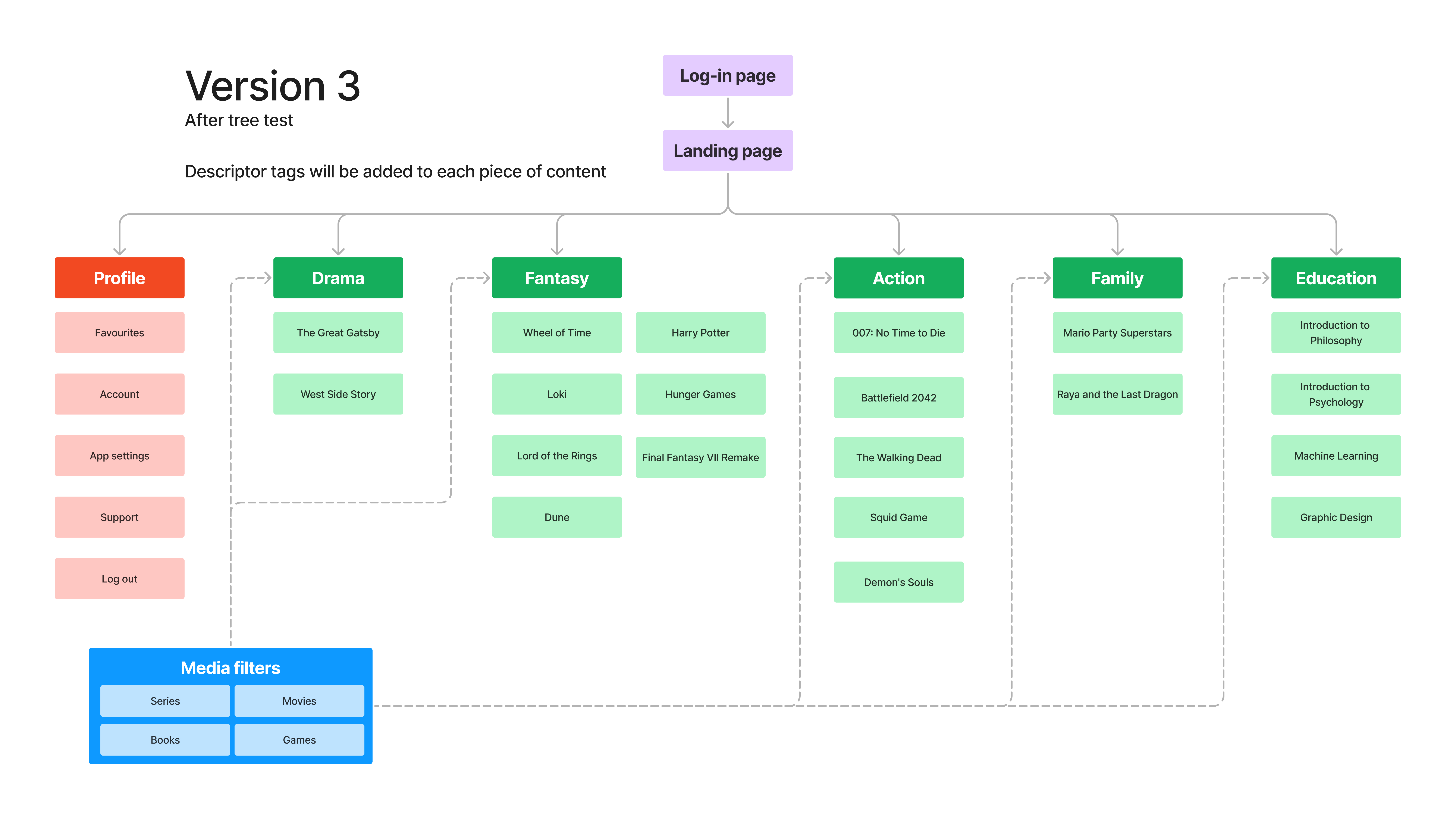
A tree test was done with 10 participants. No change in categories was needed, though some content were identified as fitting into two categories.
Lo-fi frames
Creating an exclusively landscape application can present some challenges on mobile phones, such as limited screen space and an awkward hand grip.
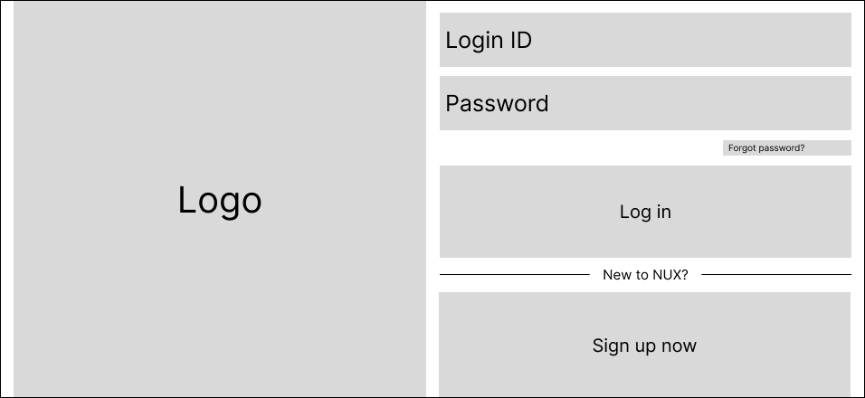


In a horizontal grip, the user would need to stretch their thumbs to access any buttons in the middle. To address this, the clickable text fields and buttons are kept to one side of the screen.
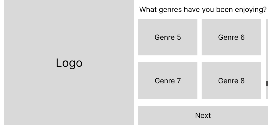
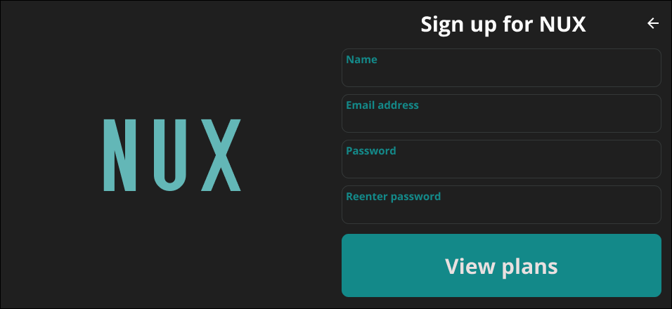
An onboarding page (a project requirement) is laid out with the same principle of keeping interactive elements accessible with one thumb for ease of use.


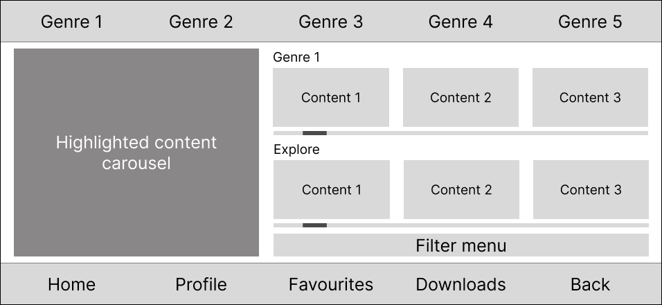
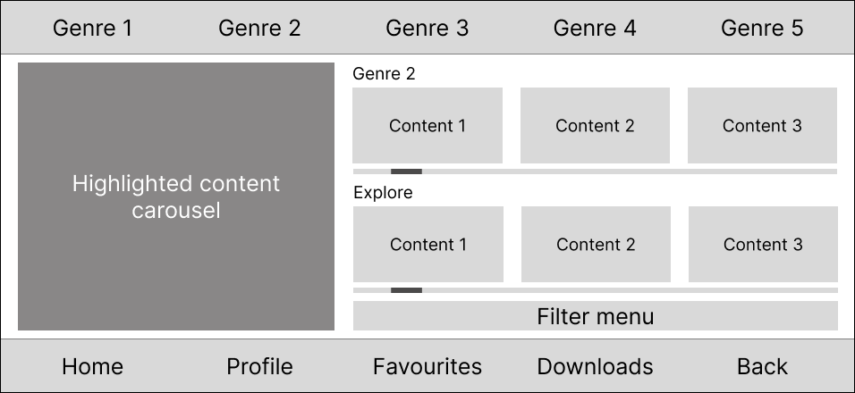
The main page uses a 5-column grid to organise the many elements required. As much as possible, elements are arranged to be easy to reach without having to stretch one’s thumbs.
Interactive elements such as the trailer and episode selection are kept to the side for easy access. More static information placeholders are kept in the middle.
At the time of the assignment, this layout seemed functional. However, upon reflection, I would have decluttered it.

First-click and navigation tests were conducted on various elements of these frames. Participants were generally successful for most tasks except for one: when asked where they would click to reveal more genres in the onboarding page, most participants missed the thin scroll bar and clicked the Next button instead. This was then addressed in the hi-fi prototype.
Hi-fi prototype
A hi-fi prototype was built based on the frames. Click here to explore the prototype! Certain parts are scrollable as well.


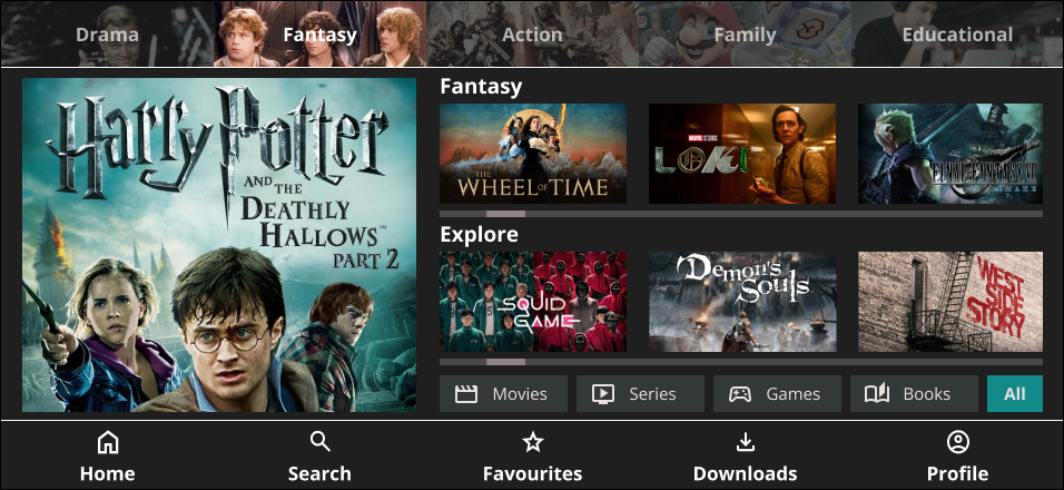


To deal with users clicking Next instead of scrolling to select more genres, the Next button is concealed until users have scrolled to the bottom of the list. Partially hidden tiles also serve as a hint to scroll.
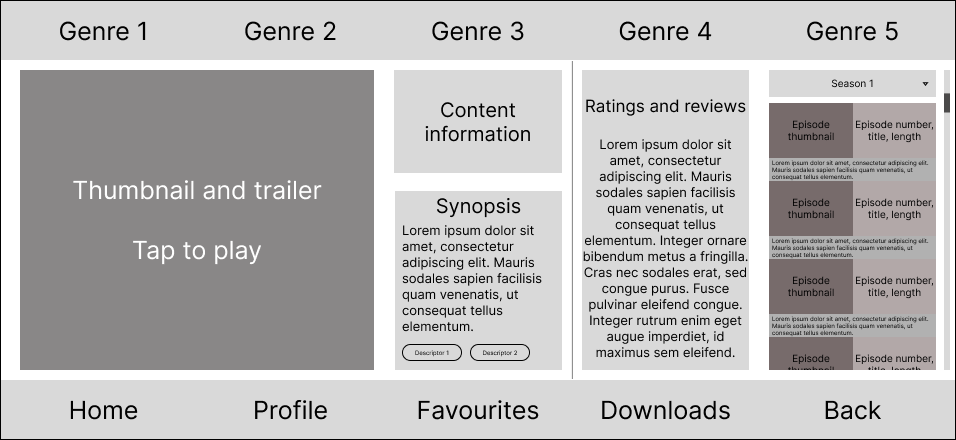
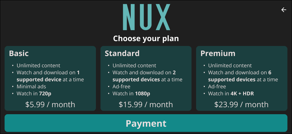
Colour saturation contrasts were in the top genre selection bar to show the active genre.

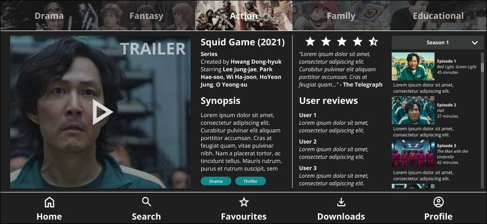
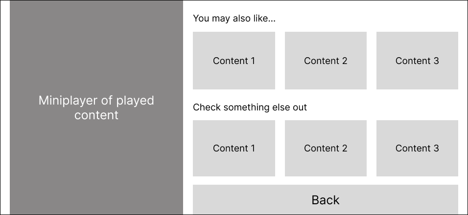
Active elements are kept to the side as in the lo-fi frame, leaving read-only elements in the middle.
Conclusion
This was my first time properly using Figma, and it became a crash course in translating ideas into interactive, high-fidelity designs. Figuring out layout, navigation, and structure within the constraints of landscape orientation challenged me to think critically from both UX and UI perspectives. More than just a streaming app prototype, this project marked the beginning of my hands-on design journey.
 THOMAS YAP